| |||


|
|
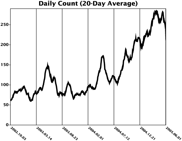
| Total | Average | Maximum | Minimum | Autodetect |
|---|---|---|---|---|
| 131139 | 132.06 | 345 | 3 | 99785 |
| (993 days) | 2005.05.10 | 2005.06.03 | (76.09%) | |
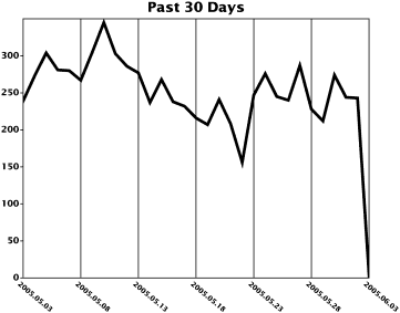
| Mon | Tue | Wed | Thu | Fri | Sat | Sun |
|---|---|---|---|---|---|---|
| 138.32 | 141.50 | 139.34 | 140.98 | 129.24 | 115.68 | 119.44 |
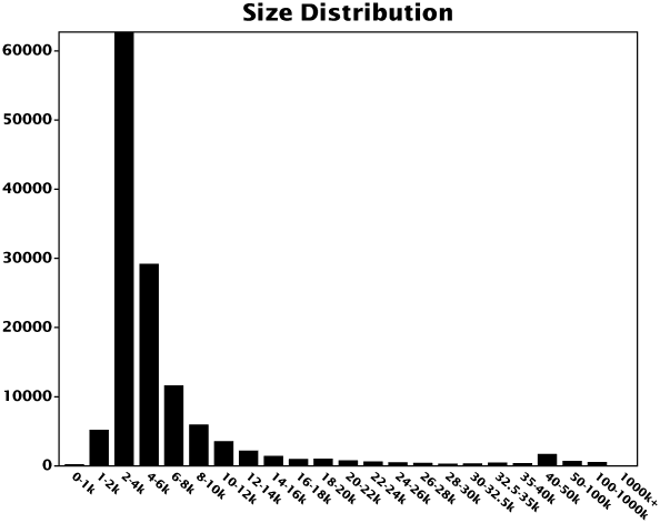
| Median | Maximum | Minimum |
|---|---|---|
| 3913 | 8627473 | 511 |
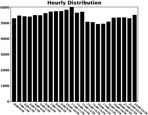
| Server | Count | Pct | Comment |
|---|---|---|---|
| #1 | 94618 | 72.15% | Kernel-HOWTO (recent) |
| #2 | 6066 | 4.63% | old, not widely published |
| #3 | 30455 | 23.22% | Kernel-HOWTO (old) |